Where live culture meets media momentum.
Updated to reflect the attached mobile reference, the page now leans harder into soft ivory surfaces, rounded premium framing, editorial gold accents, and a cleaner card-first nightlife presentation.
The visual story
The updated direction is closer to the reference: large rounded modules, softer spacing, restrained chrome, and a more tactile luxury-nightlife interface that feels native on mobile.
Framed presentation
The banner now behaves more like a featured editorial card, with a dark outer stage, pill label, and a luminous inner text panel that mirrors the reference structure.
Softer luxury UI
Ivory surfaces, muted shadows, and warm gold outlines keep the premium tone while removing unnecessary visual noise and emphasizing readability first.
Mobile-forward balance
Caption bars, centered overlays, and circular controls now better echo the mobile composition shown in the attached reference image.
Designed with a music-media tone
The page still keeps the DigiWaxx-inspired nightlife identity, but now it presents that identity through a cleaner, more app-like interface language similar to the supplied screenshot.
“The strongest event visuals do more than show the crowd—they package atmosphere into a format that feels immediate, polished, and easy to move through.”
Editorial presentation with DigiWaxx-inspired stylingObserved details
Rounded pill labels, soft off-white cards, restrained borders, and centered controls all push the page toward the reference’s elegant mobile presentation.
Color language
Warm gold remains the primary accent, while charcoal framing and subtle red highlights inside the banner reference the dramatic nightlife energy in the screenshot.
Spatial feel
Larger radii, more breathing room, and fewer hard edges give each section a calmer, premium interface rhythm without losing the event-driven attitude.
Scene components
A concise breakdown of the elements that shape this nightlife-meets-production visual language.
Venue
Double-height interior, chandeliers, fans, broad windows, and a polished event setting with upscale appeal.
People
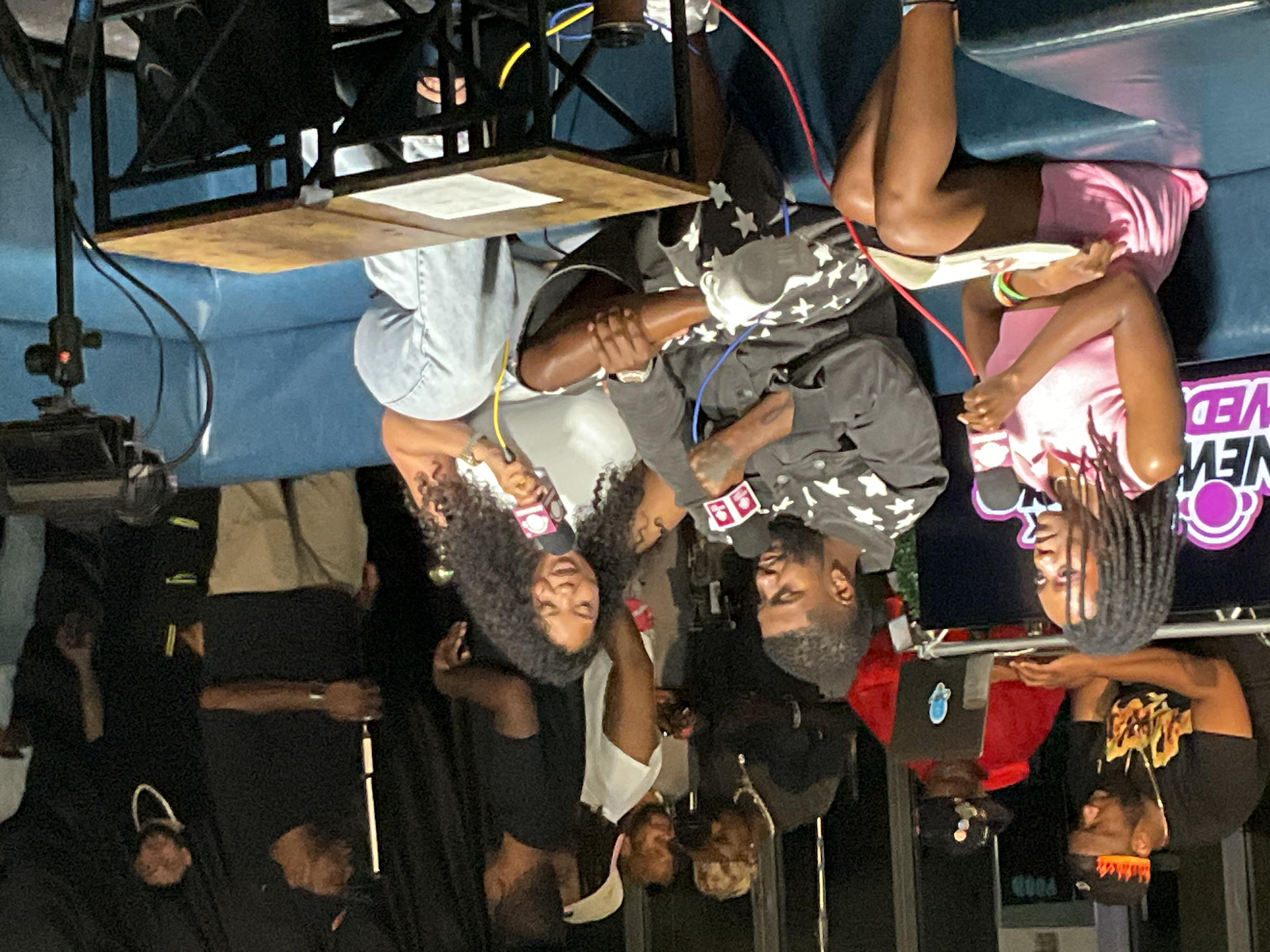
Guests, hosts, and crew shape the space through conversation, observation, movement, and live engagement.
Equipment
Tripods, light stands, fixtures, monitors, and floor cabling position the event as a captured media experience.